I read an article some time ago in a publication called Low Tech Magazine about building a website for their articles that was highly energy efficient. The goal was to reduce the site's impact on the environment which was achieved by running a homemade web server off of solar power, static site generation, and using an interesting dithering effect on images to dramatically reduce their size. I was really struck by the project and the ethos behind it -- so much so that I ended up ordering the printed version of their archive for my office. I've been trying to figure out how to incorporate the image effect with my image content on the web.
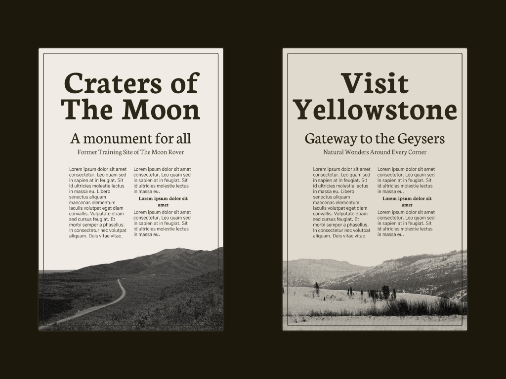
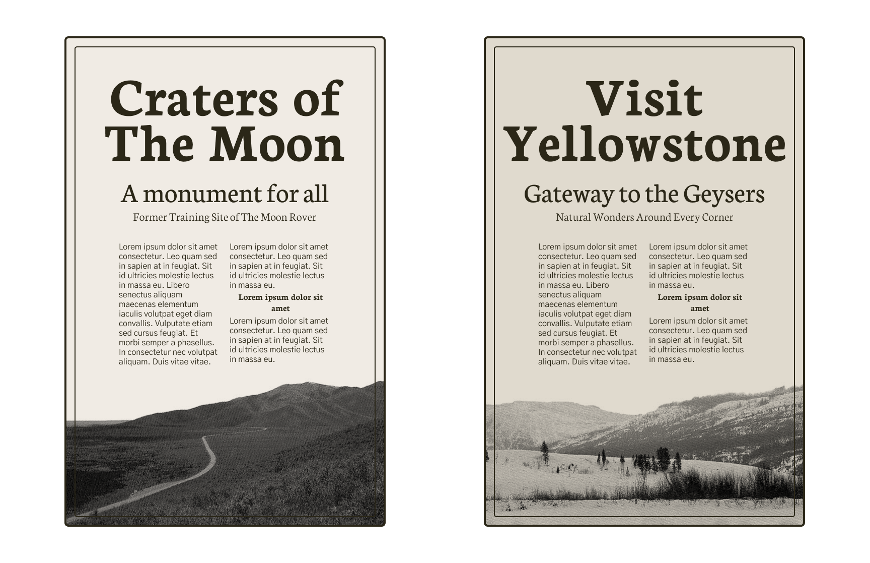
Simultaneously, I've been trying to figure out wether I can get an editorial layout to work on the web. I figured the low-fidelity image dithering would pair well. I wasn't too crazy about the style that Low Tech Mag ended on so I tweaked the method of getting the low-fidelity image. I used to screen print a lot when I was younger. When you're printing a photograph on a screen you often use an effect called a halftone, which converts the entire image into individual black or white dots. This is the method that I used to dither my photographs for my little experiment.
The style of the entire composition that I was going for was a midcentury modern newsprint ad. The fonts would make a big difference so I chose the Neuton font for the headings and the Gothic A1 font for the body copy.
Next up: I will try and figure out how I would make this layout mobile responsive.